
-
The presentation of the logo of a brand is very important to make it known.
-
The goal of this design is to connect people with the brand.
-
Consumers prominently remember the logos of certain companies.
In today’s market, the graphic image of a brand is the first face that it presents to consumers. Given this, a viral post on Twitter shows what the most iconic logos on the market would look like if they had been written by a doctor.
Specialists say that the presentation of a brand logo is very important to make it known.
In this sense, consumers show how important it is for a brand to have a logo that is made up of its fonts and colors that combine what it wants to represent in the market and that is recognizable anywhere on the planet.
Likewise, the objective of this design is to connect people with the brand, which is why a good logo is mixed with creativity and the power of expression that the company wants to show.
That is why consumers prominently remember the logos of certain companies and their corporate colors, even if they are not customers of the company.
This would be the logos
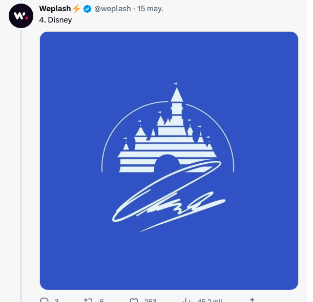
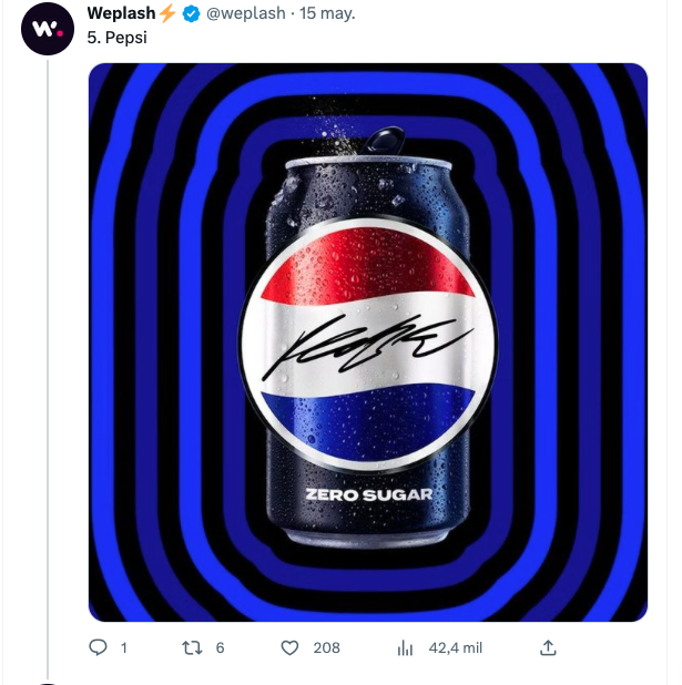
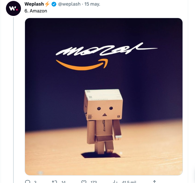
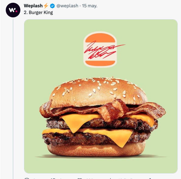
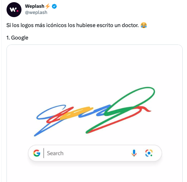
In a post on the social network Twitter, it was revealed what the logos of the most popular brands on the market would look like if they used the typography written by a doctor.
In the publication that was posted on the @weplash account, you can see what the logos of Google, Burger King, LinkedIn, Disney, Pepsi, Amazon and IKEA would look like, with a cursive and difficult to understand font, like a letter of a doctor.
The publication went viral to the point of reaching more than 4 thousand likes and various comments from Internet users.
“I would probably have a very well written ‘G’, but you would need a PhD to understand the rest of the letter,” read one comment.
“When they did the aptitude test and they saw my handwriting they let me enter Medicine, I was one of them by nature,” wrote another Internet user.
“The great mystery is how the pharmacists can understand the letter of the medical prescription, that is a mystery!!!”, wrote another Internet user.
This publication shows how important an achievement is in the graphic image of a brand in the market, since it is the first form that a consumer sees of a company.
It is not the first time that an Internet user has recreated a logo of an already known brand, as an example, the Kapwing team, an image and video editing platform, redesigned the most relevant logos inspired by the most memorable artistic trends in the world. world.
On that occasion, the platform demonstrated with this the importance of the graphic image of a brand, which is why they recreated some iconic logos, in artistic trends such as Art nouveau, Bauhaus, Psychedelic, Pop art, Retro ’80s, and design 3D.
In the dynamics of the firm, he showed the logo of the social network Instagram, the McDonald’s fast food restaurant, NASA, WWF, and the technological brands of Google, and Apple with a touch of modernism or in French Art nouveau.
And so, as this exercise demonstrated that a brand’s logo is strong, it is very difficult for it to lose its essence in the eyes of consumers.
Now read:
Maid reveals everything that guests “leave” her in a hotel in the US
Salesperson tired of being entered into his store just to ask for directions; paste viral ad
Save more energy, with Netzhome smart plugs